Environmental Portraiture. Behind the door.
My Ideas for Environmental Portraiture:
- Different Churches/ Priests and their environments.
- Neighbors/ the insight into there homes e.g. their bedrooms.
- Swapping the environment of the people e.g. a builder and place him in a hair salon.

For my project I’ve been looking at Arnold Newman, Eric Ogden and many others. They have inspired me to go along the lines of photographing people in their own homes. I want to show, through my images, how personal they can be, to get an insight into others’ lives. When the subject is unfamiliar, I find the environmental portrait offers an engaging, and sometimes challenging way to tell the subjects story in a single frame. 'A beautiful static portrait serves its purpose but we want to tell the story more'- Zana Woods, director of photography at Wired. Within my images I want to draw the personality and energy out of my subjects, to craft a narrative or create dynamic composition.
The idea I have decided to go with, is taking photographs of my neighbors, to look into their lives. I always say hello in the street but never take a great deal of interest into their lives. I would like to take photographs of them in their personal space, for instance, their bedroom. I find, with myself, that my room is the most personal part of my house. It is where you can reflect yourself on your walls, furniture and so on. I also want to show how contrasting my neighbors are. For instance I have one neighbor who is fanatical about cleanliness; everything is perfect within her home, and another, whose home is messy and unkempt. It is beautifully personal, and I wanted to reflect this within my images.
The History Behind Environmental Portraiture.
Robert Howlett
Victorian Photographer, Robert Howlett produced portraits of Crimean War heroes, landscapes and scenes. His images reflect the compelling excitement of the great engineering, such as the Great Easton.
Howlett also produced a very well known portrait of the Great Eastern's engineer and creator, Isambard Kingdom Brunel, casually standing in front of the mammoth chains.
This is known to be one of the first examples of environmental Portraiture. In this image, Brunel is positioned on his own construction site in front of the ships chains. Already there is a connection between Brunel and the location. He has been placed in front of the chains, rather than in front of a ship, which obscures his obvious environment. Perhaps Brunel has been placed in front of these colossal chains to represent how he is the integral link to his successful company. He stands in a scruffy suit, a cigar in his mouth and in a very casual pose. This indicates that he is hand's on, he takes pride in his work, not his appearance. I find this image intriguing, the amount of connotations and denotations you are able to produce out of it is remarkable, and helps you discover a bit more about the man your looking at.
Denotation
•Chains
•Top hat
•Bag
 •Dirty clothing
•Cigar
•Facial hair
•Heeled shoes
•Pocket watch
•Slouched position
Connotation
• Non caring attitude/ his stance
• Bag/ includes his cigars. He smoked 40 times a day
• Top hat/ Shows his wealth
•Heeled shoes/ To make him look taller/ He was known to be a small man
•Chains/ His hands on attitude to his work
•Dirty clothing/ He likes to work and be on the scene of his works
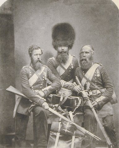
Isambard Kingdom Brunel (1857)
About Brunel: Within this image you can see Brunel was a practical engineer, he wanted to be involved. His appearance can tell us a lot about him; heeled shoes to make him taller. He was known to be a short man; he has a bag at his side, which was known to hold his cigars (apparently he smoked 40 a day!). Brunel was a man with confidence, wouldn't take no for an answer and liked to do extravagant works to show that the impossible was indeed possible. A big achiever. Also very impatient, he was known to get angry if the work wasn't done in time with his schedules.
All of these are known facts about Brunel’s character and you can catch a glimpse of them in this image. He looks impatient to get back to work, not facing straight on, he appears as though he might walk right out of the frame. His facial expression is gruff; he is not putting on airs and graces and trying to look important.
Crimean Braves (1856)
Roger Fenton
Roger Fenton, a British Photographer was known to be one of the first photojournalist's, and War Photographer. He was asked by Queen Victoria to photograph the war in Crimea; also Fenton was one of the founders of the Royal Photographic Society, and has become a vital piece of his legacy.
When the Crimean War erupted in 1854 it brought with it a unique opportunity for early practitioners of the photographic arts. A publisher selected Fenton in 1855, to document the war that had begun. Fenton entered the fray as an observer, taking with him two assistants and five cameras, in addition to other necessary supplies.
Rather than document the actual bloodshed, as a modern war photographer would, he focused instead on capturing images of the camps. Officers from the French and British armies.
The subject in the top photograph is not looking at the camera, but looking out into the distance, reflecting on unknown thoughts. This image is very linear; the weatherboards on the building he leans on, lead your eye to the subject, whilst the diagonal lines of the tent frame his slanting body. The froging on his jacket echoes the white boards, along with his white sash. His bearskin hat mirrors the lantern on the ground.
I could utilize this technique of using the environment and all its angles and lines to help guide my viewer’s eye around the composition and therefore help them to understand to narrative.


Sparling, Fenton’s assistant, gets his picture taken before heading to the Valley of the Shadow of Death. Fenton had written, “The picture was due to the precaution of the driver on that day, who suggested as there were a possibility of a stop being put in that valley to the further travels of both vehicle and driver, it would be showing a proper consideration for both to take a likeness of them before starting.”
Dorothea Lange
' I saw and approached the hungry and desperate mother, as if drawn by a magnet. I do not remember how I explained my presence or my camera to her, but I do remember she asked me no questions. I made five exposures, working closer and closer from the same direction. I did not ask her name or her history. She told me her age, that she was thirty-two. She said that they had been living on frozen vegetables from the surrounding fields, and birds that the children killed. She had just sold the tires from her car to buy food. There she sat in that lean- to tent with her children huddled around her, and seemed to know that my pictures might help her, and so she helped me. There was a sort of equality about it. (From: Popular Photography, Feb. 1960).'The images were made using a Graflex camera. The original negatives are 4x5" film.'

Migrant Mother- Florence Thompson- Family of seven/ Series.
The main image is popularly know as “Migrant Mother” and has become an icon of the Great Depression. The compelling image of a mother and her children is actually one of a series of photographs that Dorothea Lange made in February or March of 1936 in Nipomo, California.
Seeing the photograph in the context of related images, understanding the purpose for which it was made, and knowing something of the photographer's and subject's views of the occasion amplify our perspectives on the image, and, at the same time, suggest that no single meaning can be assigned to it.
The use of the medium format camera, gives the image even more detail into this woman's life. It conveys the meaning of Dorothea's intentions, to carefully pick up the immense emotions of the woman, and guides the viewer though the series, of the struggle in American society.
When I take my photographs, I would like to transfer some of the qualities of Lange's work, by maybe using a medium format camera myself. Getting that quality of a wider frame, selecting all the detail of my subject, and subject’s surroundings.
My test shoot


Overall, in this shoot I found things I want to convey in my final images, such as, positioning, the subject not smiling, front on looking directly into the camera; I find these attributes will make the images much stronger. I tend to struggle with lighting so I will use a flashgun when I do my shoots. I want to create a moody/ gritty look into some of my final images to create contrasts between all of them, as my subject’s personalities differ quite a bit.
My Favorite images from the test shoot:

This was one of my better images from the test shoot; it held good use off the environment. I know I usually like it when the subjects don't smile, but when I was taking pictures of this man, he was very bubbly and friendly. I think his laughing reflects his personality. His smile is contagious and makes you smile. I didn't use a flashgun, I used the flash on my camera, and I found it came out quite harsh on flash face. I placed this man in what I thought to be a good location within his shop; I positioned him in front of all the wood, submerging him to be part of the environment.

The girl in the hat shop. One of my very favorites, this is because the lighting is really atmospheric, and contrasted. Her positioning was just as I found her in the shop. She was very shy, and kept shying away from the camera, but I think I managed to catch her at the right time.


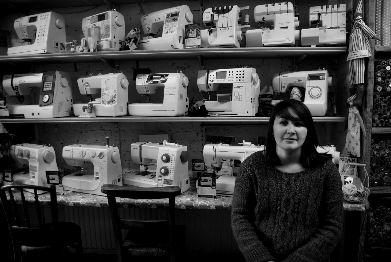
In this seeing shop I got my subject to sit on the chair, but I really think if I had longer I would of had her standing in front of all the seeing machines, with her head obscuring one go the machines. Lighting was fine in the shop; it had a lot of natural light flooding in. When converting to black and white, I found I struggled to lighten her face, and it is a tad to dark.
Looking at Smirnov's work, I was first attracted by the positioning of his subjects. Your eyes fall upon them, enabling you to absorb their surroundings. The images below, I found reflected environmental portraiture the most in Smirnov's work, each one has coherent lines and help the eye follow around the subject.
My favourite of the four, in the bottom left corner, of the two men, immersed in their surrounding, the different textures of the metal contrasts to the men’s smooth clothing. The flashlight picks up the detail in their faces and clothing, creating harsh shadows behind them. The low angle makes the men look intrusive, and powerful, which reacts with the location.

On my test shoot I tried to create this reaction, between location and subject. I found that when getting them to work together, makes the image stronger, just like Smirnov's images, they create this flow of intention and directness.
I think Smirnov, in these three images, was trying to convoy a type of still life portrait. I think this because, within the second image, the subject is just balancing on a stool, which is reflected in his surrounding; the building standing tall, Smirnov has reflected within the positioning of the subject. The orderly lines on the wall and floor draw your eyes to the subject. They frame him against the sky.
Blane Davis
Blane Davis, I found his images useful. The way he photographs people within their own home, helped me in the way he positioned his subjects, the way he used the light as well. The three images I have chosen reflect that sense of relationship between subject and home. The portrait of the young boy on the left, is powerful in the way he is looking straight at the camera, it creates this tension between the viewers. I found it like he was trying to communicate with me. They only thing I didn't like so much was the fact his face was a bit dark, I think if Davis lightened up his face the connection with his eyes would have been magnificent.


In the middle image, even though its not so much a portrait, I found the use of environment very creative, reflecting her religion and culture, in her positioning and surroundings. In the last image, I found the lighting beautiful. On the subjects skin and motorbike.
Davis said 'I much prefer to live in a place in order to understand it and somewhat be a part of it. ' This statement of his shows he was creating a relationship with his subjects. I really think he managed to in these images, they all look trusting, and in no way intrusive. The colouring, as well, conveys the state and climate they live in. The browns and beiges, compliment the subjects themselves.
Sukanto Debnath
Non- Environmental Portraiture:
The reason I'm showing non environmental portraiture, is to show the differences, and understanding between the images below that they are just showing the environment, and are, to my opinion, spontaneous shots. Even though they aren't what I'm looking for, the use of location, lighting and composition drew me in and helped me think about how I'm going to use my location to its advantages.

Portraiture:
With Sukanto Debnaths work, she uses great locations and has a fantastic eye for capturing people’s emotions in portraits. The portraits I have chosen I find influenced me in the way she gets all the detail and raw quality from the subject. For example the woman in the bottom left, I found it mesmerizing. You get soaked up into this woman’s face, and start asking questions about her. The wrinkles in her face made me think of worn out leather, her expression shows tiredness, and longing.

Using My Equipment and Setting Up
 The equipment I used:
Cobra Flashgun:
Worked really well; I found that I didn't need to mess around with it, I could just start shooting. However on my second shoot I found I kept bleaching out the subject but after many attempts I managed to get it to not such a high setting.
Tripod:
 I only used the tripod once or twice, but found I liked to shoot hand held much more; easier to move about and not keep fusing about with it.
 Camera:
Nikon D3000.
When shooting:
I put my camera onto Manual. Set my aperture to its widest, for example F4.0.
Set my shutter to around 1/60. I found it hard trying to shoot, handheld, with anything below 1/60.
I used my external flash; bouncing the light off the ceiling I found, it lit my subject perfectly; and when doing test shots with the flash directed at my subject seemed to bleach them out; bouncing was much better!

Second shoot; Example of bouncing the flash: You can really see the difference:

Lighting
As I've said, lighting was a bit of a problem in most of my shoots. All of my images where taken in side so lighting conditions where very dark. When looking at all of my con tat sheets you can see i had problems with colour casts and over exposure and underexposures. In the end i thought i had better just use a flash gun. I had never used a flash gun before, so i did struggle to begin with. In the end after doing a few test shots, i managed to get the hang of it. I can now say that I love using a flash gun and would
early like, in future projects to use multiple flash guns to create more depth in the images.Harry Callahan
Harry Callahan self-taught himself in photography. Ansel Adams influenced Callahan’s early photographic work. When I look at Callahan's work, I find that it is an exception; it draws the viewer more insistently inward, toward the centre of Callahan's private sensibility. The sensibility is expressed in his attitude of the subject; remarkably personal and restricted in its domain.

For many years Callahan has photographed his wife and child on the streets of the Cites he has lived. He manages to create a stunning images by using materials so close at hand and so universally and obviously accessible, that you might have supposed that a dedicated photographer could over do their potential in a fraction of that time. Yet in the case of Callahan, he repeatedly made these simple experiences new again by virtue of the precision of his feelings.
Callahan has responded attentively as a photographer, to the quality of his own life; photography has been his method of focusing the meaning of his life. For Callahan, photography has been a way of living, his way of meeting and making peace with the day.
With his work being so personally orientated, many of his pictures, artistically interpret his family relations especially portraits of his wife, Eleanor, and daughter, Barbara. His early work experimented with representational abstraction. I found his work to be graceful, and artistically directed. The coherent lines, and harsh contrast draw in this fantasy world, that the viewer wants to see over and over again.
First Shoot
Ben Mitchell
In this shoot I used a 'Cobra' Flash head, on my Nikon D3000; first time I really ever used a flash head, and I found it illuminated my subject perfectly.
When analysing my contact sheet I had many that where underexposed, and some that had a yellow/ orange cast to them, when I used my flash on the other hand, it highlighted the necessary areas, for example, his face and background.


I managed to find a couple of images that I think fit best to the criteria; they include, good composition, lighting, and my subject looking directly into the lens. And also, not smiling which I find much better than smiling. With Ben, he's not a smiley person so this worked well with him!
The image's I've narrowed it down to:
(Flash used on all)
(Flash used on all)

ISO: 400
Shutter: 1/15 sec
Aperture: F4. 5
I really like the composition. How he has a slight smile. Only big problem is the flash you can see reflected in the mirror. I can edit this in photoshop. I also find the small space he is confined in makes him look out of place.
 ISO: 400
Shutter: 1/15 sec
Aperture: F4. 5
Composition is really nice in this shot. The mess surrounding him. He looks relaxed not awkward and he isn't smiling which was great!

ISO: 400
Shutter: 1/15 sec
Aperture: F4. 5
I really love thins image but he would have been much better if he was looking at me. It would have made it much stronger.

Other Images i found worked well But not as strong as The one i chose from the shoot. I liked these because the composition was really good, submerging him in his environment. But i found they where a bit to dark. And in the bottom image, i do like the fact he seems really relaxed but i think its much better for him to be looking at the camera like in all the other shoots, they all look at the camera, and it would just look odd to have one that isn't.

Final Image from Shoot:
I chose this image because, he is turned straight towards me, his expression is half way between a smile. The lighting is a bit over exposed on his face but I can edit it on Photoshop, and Lightroom.

Final Image:


When editing this final image, I used a collaboration of Lightroom and Photoshop. Lightroom I found helped me create this raw quality to the image. Photoshop was good in changing the cast and levels to the image. I wanted to create depth to this image. With the right techniques, I found I was able to.
Text to accompany the image:
'This is my next-door neighbour's hermit Ben Mitchell; He lives in an old band room in the back garden. Ben came back from Australia and had nowhere to live, so ended up in there. Ben let me take photos of him the day before he left to go travelling in India. These images are an introduction and goodbye for me.'
Specialist Location Photography
I wanted to show the different location photography even though its not strictly environmental portraiture.
• Fashion
•Commercial
•Documentary
Matt Jones- Fashion
These fashion shots really drew me in. The environment reflects the model and vice-versa. Broken dead trees, and the model is hinted over and is in broken positions.
The thing with fashion and the way they use the environments, is they always try and succeed in creating a relationship between the two. Reflecting the clothing with the environment helps create a story line. Like in the images below, Dark, atmospheric clothing; her hair is like straw and resamples the straw twigs in the background . It gives the viewer something to follow, just like in environmental portraiture, you are trying to tell the viewer what they are seeing, the subject and what they do, the surroundings are everything in both fashion and environmental portraiture, they create a scene that can imprint and be significant to the viewer and that is what it is really about, relationship between the two.
The thing with fashion and the way they use the environments, is they always try and succeed in creating a relationship between the two. Reflecting the clothing with the environment helps create a story line. Like in the images below, Dark, atmospheric clothing; her hair is like straw and resamples the straw twigs in the background . It gives the viewer something to follow, just like in environmental portraiture, you are trying to tell the viewer what they are seeing, the subject and what they do, the surroundings are everything in both fashion and environmental portraiture, they create a scene that can imprint and be significant to the viewer and that is what it is really about, relationship between the two.

Dean Whitling
Commercial photographer
As a photographer, as you can tell Dean Whitling has an artistic eye. Capturing the essential nature of the environment and subject. Even though he is a commercial photographer there are elements of environmental portraiture in his work. In the images below, you can see the way Whitling, wants to put a purpose across, this is obviously due to the commercial side.

“Dean has an amazing ability to ‘capture’ infrastructure within an environment, making him one of the key photographers we turn to when we are looking for that ‘iconic’ image.”
Michelle Palmer - Manager Corporate Communications
Jose Ferreira
Documentary
Jose Ferreira's images are the most outstanding and beautiful images I've seen. Most are portraits, but some hold the element of environmental portraiture. The images I find reflect that element, shown below; have a raw and magnificent detail, which it bestows to the viewer. The impact of the single image creates a kind of nostalgic tension. His positioning of the subjects just seems to have formed like they have just looked up at the camera.
The first two images are from a series called, "Nomadic Sight" it is a documental photographic project, produced from the need to acknowledge and assimilate different sights of life and culture. Providing a different approach and perspective on these enigmatic people.


In this image you can see Ferreira was trying to give an expression, to his care and interest to this race and recorded the charm of this culture, as rich as mysterious. The harsh shadows hovering over her, and bits of light falling across her kitchen and face, showing this hidden world coming to life. Expressions, postures and habits, flooded through his camera producing spectacular images. With these photographs you can grasp a lost world full of familiar gestures, that still strictly bound present with past.
More than simple images, Jose Maria Ferreira captured the soul of the people in every face, every look, every smile and every tear...


Comparing different specialist location photographers:
Comparing different types of specialist location you get a variety; for instance with fashion photography you are instantly looking at the typical locations, such as, studios, old buildings. In fashion shoots, they are carefully styled so you are always wanting to see a mysterious, out of this world locations, for example Tim Walker, he always does bigger and better shoots, within old buildings and giant props.
When looking at commercial photography, you are usually in the products or subjects location, always relating to the work. When I was looking at Dean Whitling, you can see that he always had the subject, in the uniform of the company or had a hint of what he was trying to convoy in the frame.
Documentary photography on the other hand always varies but I find mostly in homes, this enables the viewer to connect to the subject in a totally different way, especially when comparing them to, commercial and fashion locations.
Overall, when comparing these specialist locations you can affectively draw different aspects from each. When looking at my locations I will take, say from a documentary location, homes and place my subjects in standard positions or, like in fashion locations have them using their locations to the best potential.
Arnold Newman
Location
 There is a reason why Arnold Newman is one of the most renowned American portrait photographers. Newman's environmental portraits offer the world unique images of famous-and not so famous-people. His images show people within an environment that says much about them. Often a very personal aspect of the subject is revealed by the surroundings and the decisive moment in which, Newman captures his subject.
 The way Newman uses his location to its potential is outstanding. He varies the angles that, depending on the subject, can come across powerful and intruding. For instance, the very bottom image, its low angle and brilliant lighting casting a semi shadow over the two subjects, creates this intense and overwhelming presence. I think by using a medium format camera, really allows the viewer to see the detail, and environment these men belong in.
With Newman's work I think, for me to try and convoy his brilliant techniques, I would really want to use a medium formant camera. And maybe, a different concept, for instance, I was going to go along the lines of photographing Priests, I think, the camera and the low angles, say in a mammoth church would convoy Newman perfectly.
Eric Ogden
Lighting
Eric Ogden has a way of enabling, an aspect of the subject’s life or personality, or simply lends atmosphere or graphic interest to the composition; He has an understanding of the subjects, and a way to communicate their insights to the viewer.
Ogden's way of placing the subjects in an environment helps draw out their personalities. He says that he gives his subjects something to play off whether its a chair, a window, but lending a narrative quality to the image.


When looking at the image of Paris Hilton, it has a cinematic look and feel about it. And her positioning on the counter is perfect because you are able to see her reflection in the cabinets, which reflect her facial expression; she looks like she's in a deep thought, and these mimics of her play off of her.
Ogden is skilled with lighting, which is one of the aspects that drew me to his work. When looking at the image above, the light flooding through the window is harsh and atmospheric but lights the parts of her face and body that is essential to the shot. I’m not fond of cinematic photographs but their image has a different feel to it.
Second Shoot
Sophie Odell
When looking at my contact sheet you can see how much I struggled with the lighting. It either came out unbelievably over exposed, or an orange cast. But after some time, I managed to sort out the camera; to 1/8sec, aperture F4 and an ISO of about 400. Having it on the low shutter/ aperture, with the flashgun, I managed to create good lighting, with a good amount of shadow, and light on her face/ body. (This is towards the end of the shoot)


In these images I wanted her to sit amongst the clothing like she was being absorbed into them, as if they confined her there. This is because Sophie told me that she spends most of her time crawling in and out of this strange wardrobe. I thought to convey this in the image to get her surrounded and pushed behind.

Shutter: 1/15 sec
Aperture: F4. 5
I really like the composition. How the tunnel like wardrobe confines her to her space. I directed her to face me. I thought the directness would work well.

Shutter: 1/15 sec
Aperture: F4. 5
In this image i think it is much stronger than the one above. This is because I wanted to produce an image that looked like I found her there, just turing her head slightly, as if to say,' oh you found my in here again'
I think the structure of the shot is better, because it is more symmetrical in the way the lines guide your eyes to her.
Final Image from Shoot:

I settled on this image, I think it fits to the criteria of environmental portraiture. When looking at the image it needs a bit of a lift on her face and some of the surroundings. I want this image to have a soft look to it as it is contrasting to the final image on the first shoot. I want her face to be lifted out, and have her surroundings contrasted to her body.
Final Image:

Text to accompany the image:
"Sophie Odell is a neighbour who lives down the road, she's 15 and still lives at home. I asked her where she spends most in her room and she said, in the little cubbyhole where she keeps her clothes. She told me she spends most of her time in there because she has to crawl in every time."
Paolo Patrizi
Paolo Patrizi is a documentary photographer, but I find these images also fall into the category of environmental portraiture, these images show the environment that these women have to live and work in, its their home; these images explore a theme, common to many of us in the so-called developed world.
Across the spectrum of Patriziʼs work, you can see an approach to visual storytelling that is marked by an intellectual and artistic strength, at the heart of which is a compassion and feeling for the people and cultures.

I feel these images influenced me by the way they are all connected, interjecting a story, which for the viewer becomes absorbed into. I also find the way he can make the viewers feelings change towards theses women, giving a different light on their life choices, or in cases the life they have to live, to live. The uses of colours are lush and vivid, which contrasts to the story it’s telling, (dark and uninviting).
Third Shoot
Kate Histed
Looking at my contact sheet, you can see I tried to experiment with natural lighting; which didn't go down very well. I only had a couple of images to work with, most where over exposed or to dark!


The image I've narrowed it down to:

ISO: 400
Shutter: 1/15 sec
Aperture: F4. 5
This image was the only one I found, that really worked; the lighting is a bit over exposed in some places, and under exposed on her face. I can easily readjust this in Photoshop.
Editing process on Photoshop:
Firstly I duplicated the layer:

Secondly I went to Filter> Other> High Pass:


Secondly I went to Filter> Other> High Pass:

I changed the pixels to 5.7:

I then change the layer to a soft light:

As you can see it brightened up the areas that where very contrasted like the cats face.

When editing, I used the high pass process, to pick out more of the detail I lost from the original image. I have included the process above, to show the differences between original edited and final edited image.
I feel this image shows her environment well. And the detail in her surroundings, really pop out to, and attract the viewer to look into her life.
 The text to accompany the image:
"Katie is a designer, she lives opposite me and lives on her own. She has a cat called Emma, who very willingly posed for me."
Fourth Shoot
Lelia Wilson
The last shoot, with Lelia. This shoot went all right but as you can see from the contacts, I struggled to get the right lighting. I found that the location was used to the full potential. I mainly used an ISO of 400, F11 at 1/8 sec, I found with using the flashgun in the dark location this was a good setting to use.


The images I've narrowed it down to:
I found these three images, out of most of the contact sheet, to have a good tonal range, and use of the environment. I used the flash head on each one.

ISO: 400
Shutter: 1/8 sec
Aperture: F11
This image has good lighting, a tiny bit of a colour cast. But can be taken out on Photoshop. I think to make it better, I could have moved a little lower, and been looking up at her, so that she would have absorbed in her surroundings a little more. And not have the door to the left of her in the shot. I find it distracting.

ISO: 400
Shutter: 1/15 sec
Aperture: F13
The reason I chose this image is that I find I managed to capture her personality and the person she is, by including as much as the surrounding as I could. The mess of clothing, I found that the viewer could relate to.

ISO: 400
Shutter: 1/100 sec
Aperture: F16
The image is quite dark, but I chose this one because I found it gave an atmospheric feel to it. The way she positioned herself, showed she was confutable. The other thing I'm not too fond of, is her expression I would have rather she didn't smile at all.
Final Image from Shoot:
I settled on this image, I think it fits to the criteria of environmental portraiture. When I go to edit the image I will take out the colour cast; burn on some of the surroundings and try and lift her out from behind the mess in front.
Original:

Editing process:
First off, I want to remove the colour cast. I did this by going to Layer: New Adjustment Layer: Hue/Saturation. I then had the new layer and located, with the Info tool, how much reds, greens and blues where in the image. I found that it had a lot of red: 177.
All editing process images

On hue/saturation, I then single out the reds and adjusted the level to control the amount of red:
As you can see from these two images, the deference is surprisingly good!
Its taken out the harsh reds on her face and cupboards.

After:

Final Image:

When editing, I tried to make the image more contrasted and have a gritty kind of look. I achieved this in Lightroom; edited it further in Photoshop, to make her stand out from the mess in front of her. I feel this image shows her environment well. And the detail in her surroundings, really pop out to, and attract the viewer to look into her life.
The text to accompany the image:
"Lelia Wilson’s house recently flooded and is now complete chaos. I asked her to reflect her mood about what had happened into her expression. She told me that ' I don't live here. I exist here.'"
Final Four Images.

"Sophie Odell is a neighbour who lives down the road, she's 15 and still lives at home. I asked her where she spends most in her room and she said, in the little cubbyhole where she keeps her clothes. She told me she spends most of her time in there because she has to crawl in every time."
"Lelia Wilson’s house recently flooded and is now complete chaos. I asked her to reflect her mood about what had happened into her expression. She told me that ' I don't live here. I exist here.''
Conclusion
When creating a final idea for this project, I found it quite difficult, but I think the one I chose was a success. Photographing my neighbors was quite a challenge. I am a shy person so going up to the ones i didn't know was a big test. When taking the images I found using the lighting was really hard, getting the right exposure and trying not to over expose or create colour casts was difficult. If I could re-do all the shoots I would want to try a use multiple flash heads, to light up the rooms more, and even use a medium format camera.
With each of my final images I feel I embraced the concept and collaborated each of my influencing photographers, and created good photographs. On some, for instance the image of Leila, i would have liked to re-shot it at a different angle to block out the door. And in Kate's photograph, I really needed better lighting.
When showing my final images to my peers, I found there criticism helped me to make creative changes to my work.
Amy: 'I found Sophies images where really creative and presented her concept well. I think the composition in, 'Sophie Odells' image was really good, but could have been a little lighter, to me it was a bit to contrasted.
Freddie: 'The image of ben was really good, gritty and contrasted, reflecting his surrounding well. Only problem in the image is that you can see the reflection of the flash in the mirror, for me its a bit distracting.'
When taking this in, i found that it made me see how others saw my images and they spotted things out i never did.
Overall I really loved this project, I managed to pluck up the courage to take to people i don't know and this will be very helpful for the future. I used a flash gun for the first time, and used it well I found. If i could re do this project i wouldn't change my concept, but i would have liked to have got images of more people in my street, to show the variety and differences between them, and how we never really open up to neighbours, and how we put on a front when we see them.